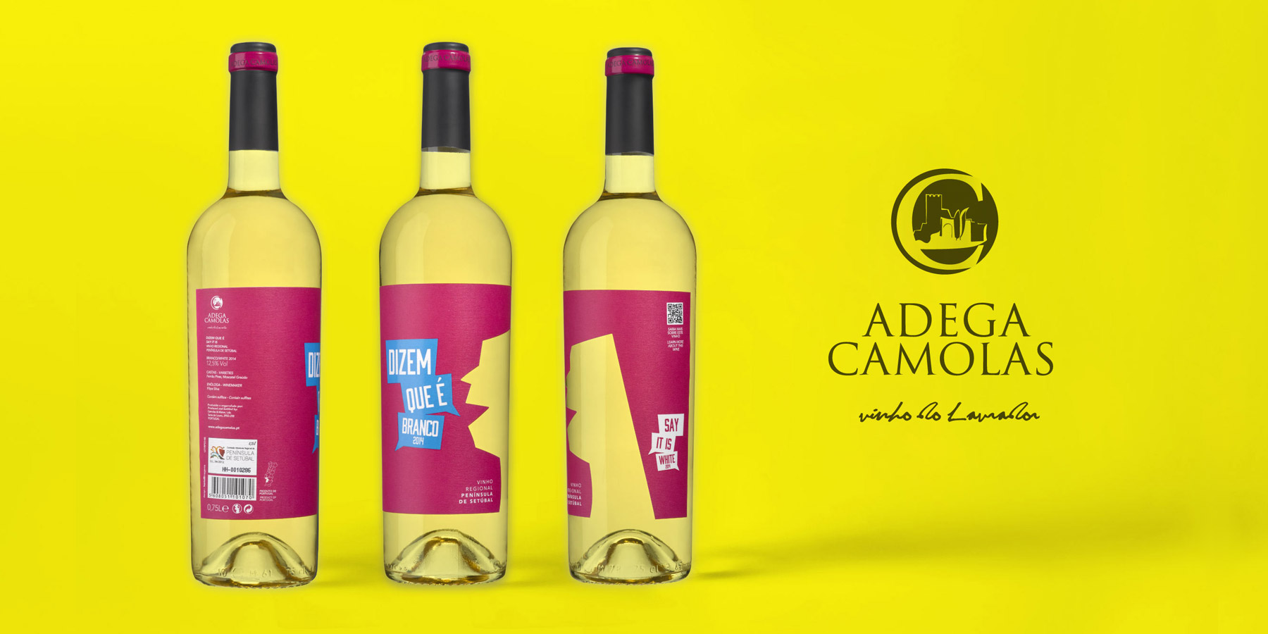
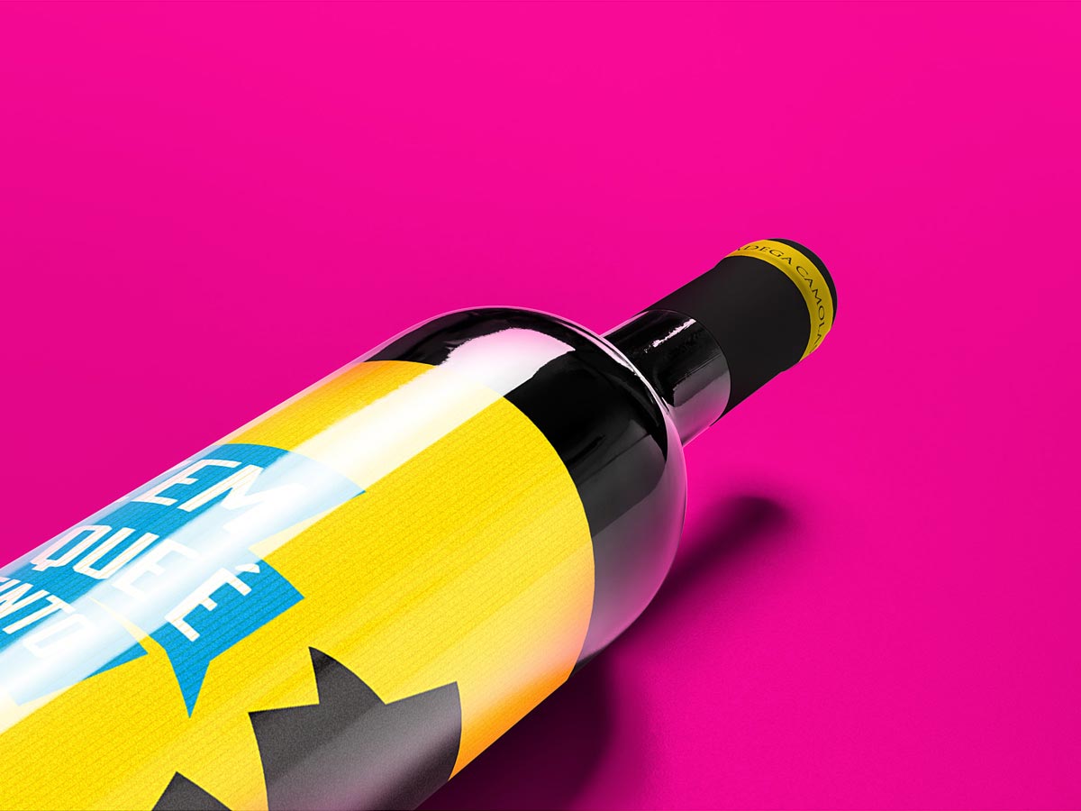
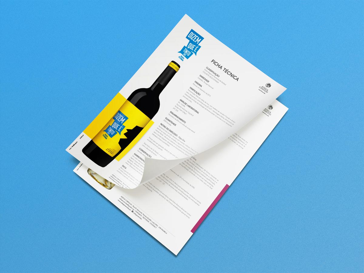
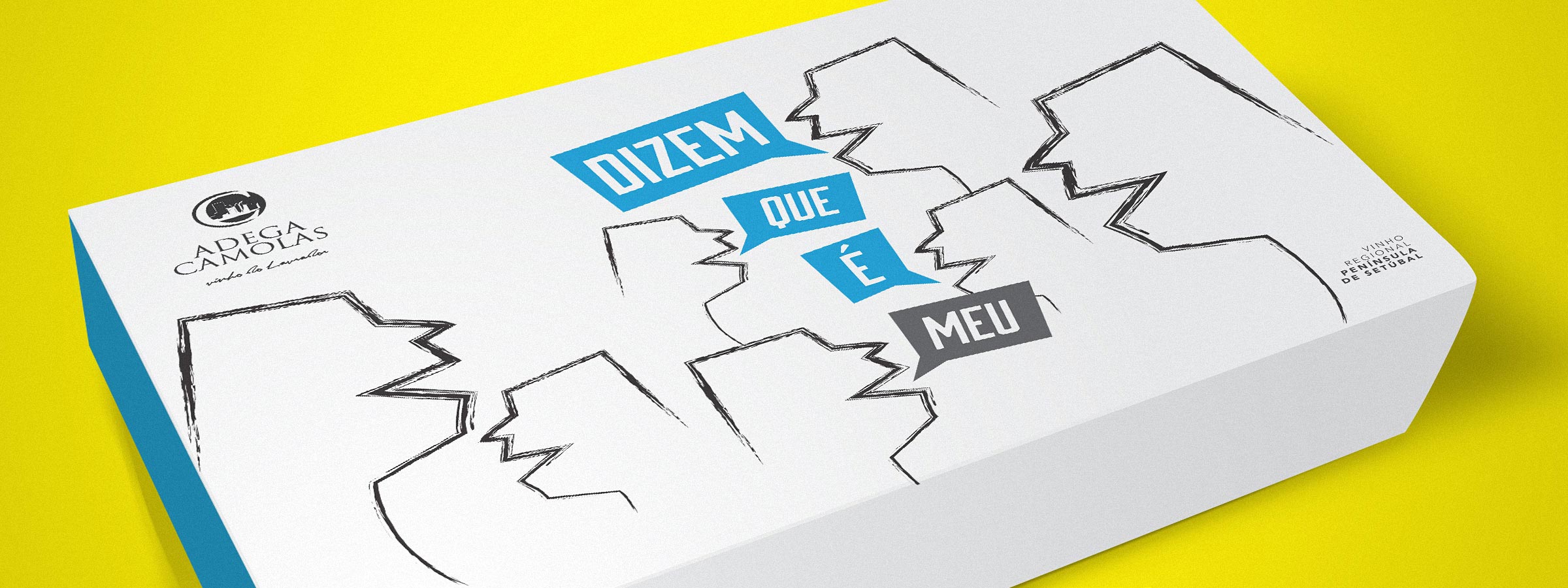
Dizem que é
The challenge was clear: a new wine with a bold name and a matching image. Directed at a younger audience, Dizem Que É makes the difference. An open label with a talking silhouette, presenting the name of the (red) wine in speech balloons. The analogy and playfulness of a good conversation over the table, accompanied by a great wine, was the premise for brand, label and packaging of the Dizem Que É. The strong colours were used to give contrast in relation to the wine colour and to make the product stand out in sales point shelves. The transportation package with two bottles is aligned with the differentiating aesthetics. The goal was to obtain a cohesive image from beginning to end.